|
|
fonts
May 11, 2019 10:41:04 GMT
Post by "BING E BONG" on May 11, 2019 10:41:04 GMT
Gill Sans has been my favourite for a while now: 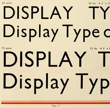 but you know 'Gill Sans' isn't always Gill Sans. And anyway I think it was overused with those stoopid 'KEEP CALM AND...' posters you saw a lot a few years ago. and as far as more exotic fonts goes, I really like this one, which you still occasionally see on old buildings (our old pal Bryan E has a Fb page dedicated to it):  (he says it's called 'PROFIL' but I've seen another name) and then there's this one - KABEL - which is used on the second VU album: 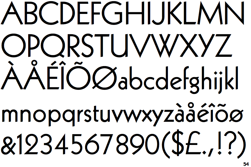 isn't that beautiful? I think so, anyway I've got a free app on my phone called WhatTheFont - you take a pic of a block of text and it suggests font names. Useful if you're a nerd. |
|
|
|
fonts
May 11, 2019 10:41:45 GMT
Post by "BING E BONG" on May 11, 2019 10:41:45 GMT
I think 'font' is used incorrectly in many instances. Overused, for sure. We should say 'typeface' or something.
|
|
|
|
fonts
May 11, 2019 14:41:06 GMT
Post by Half Machine Lipschitz on May 11, 2019 14:41:06 GMT
I think 'font' is used incorrectly in many instances. Overused, for sure. We should say 'typeface' or something. As I understand it, the typeface is the design set and fonts are the various iterations, eg. KABEL ital. or KABEL Bold. Something like that, right? I like the one used on The Lounge very much. It's an interesting subject! |
|
Deleted
Deleted Member
Posts: 0
|
fonts
May 11, 2019 14:42:42 GMT
Post by Deleted on May 11, 2019 14:42:42 GMT
I use to be a font freak, now less so. Creating marketing materials of all sorts - ads, retail packaging, direct mail,(now email marketing), catalogs, etc. for almost 30 years, you become aware of what font you need for what message and what audience. It's an important part of the messaging puzzle, like layout, color, etc.
I use to use Palatino for all business correspondences. I thought it was more elegant than Times Roman. Now I use Calibri. It's a sans serif font, but it's very readable.
|
|
Deleted
Deleted Member
Posts: 0
|
fonts
May 11, 2019 14:49:58 GMT
Post by Deleted on May 11, 2019 14:49:58 GMT
I think 'font' is used incorrectly in many instances. Overused, for sure. We should say 'typeface' or something. As I understand it, the typeface is the design set and fonts are the various iterations, eg. KABEL ital. or KABEL Bold. Something like that, right? I like the one used on The Lounge very much. It's an interesting subject!So, if that lounge owner asked me what I thought of that sign, I'd immediately ask why he chose to put red lettering on a rust colored background. The white outline on the text doesn't make it stand out enough. If I'm assuming that he wants to draw people into his business with his signage, why not reverse it like the "bar" signage below it? And does he really need "bar" under the lounge signage. The signage already screams what it is. It's blatant enough with the font selection, although I doubt they were conscious of it when they chose it. Better that they put something like "No one under 21 allowed inside" or "Big Screen TV" or "Watch Sports" or something like that to qualify their audience. |
|
|
|
fonts
May 11, 2019 18:26:44 GMT
Post by tory on May 11, 2019 18:26:44 GMT
|
|
|
|
fonts
May 11, 2019 18:32:45 GMT
Post by bungo the mungo on May 11, 2019 18:32:45 GMT
absolute nut-job who owns this place. my favourite shop and shop-front font. 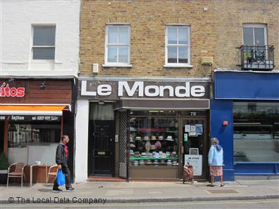 |
|
Deleted
Deleted Member
Posts: 0
|
fonts
May 11, 2019 19:23:52 GMT
Post by Deleted on May 11, 2019 19:23:52 GMT
   <iframe width="18.460000000000036" height="12.580000000000041" style="position: absolute; width: 18.46px; height: 12.58px; z-index: -9999; border-style: none; left: 12px; top: 71px;" id="MoatPxIOPT0_95393865" scrolling="no"></iframe> <iframe width="18.460000000000036" height="12.580000000000041" style="position: absolute; width: 18.46px; height: 12.58px; z-index: -9999; border-style: none; left: 866px; top: 71px;" id="MoatPxIOPT0_64954718" scrolling="no"></iframe> <iframe width="18.460000000000036" height="12.580000000000041" style="position: absolute; width: 18.46px; height: 12.58px; z-index: -9999; border-style: none; left: 12px; top: 637px;" id="MoatPxIOPT0_5591933" scrolling="no"></iframe> <iframe width="18.460000000000036" height="12.580000000000041" style="position: absolute; width: 18.46px; height: 12.58px; z-index: -9999; border-style: none; left: 866px; top: 637px;" id="MoatPxIOPT0_74073148" scrolling="no"></iframe> Maybe it's a franchise, but if it isn't, someone in marketing isn't doing their job. |
|
|
|
fonts
May 16, 2019 19:04:40 GMT
Post by bungo the mungo on May 16, 2019 19:04:40 GMT
|
|
rayge
Administrator
hopeful
Posts: 9,266
|
fonts
May 16, 2019 19:59:09 GMT
Post by rayge on May 16, 2019 19:59:09 GMT
Maybe it's a franchise, but if it isn't, someone in marketing isn't doing their job. It is, or was, a chain, but those fronts are from different periods |
|
Deleted
Deleted Member
Posts: 0
|
fonts
May 16, 2019 20:06:35 GMT
Post by Deleted on May 16, 2019 20:06:35 GMT
I'm a Berlin boy myself. 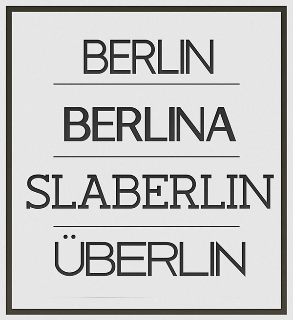 |
|
Deleted
Deleted Member
Posts: 0
|
fonts
May 16, 2019 20:13:19 GMT
Post by Deleted on May 16, 2019 20:13:19 GMT
I'm a Berlin boy myself.  That was never in doubt. |
|
Deleted
Deleted Member
Posts: 0
|
fonts
May 16, 2019 20:16:22 GMT
Post by Deleted on May 16, 2019 20:16:22 GMT
The font is now actually called Gilligan's Island. You can get it off a site called dafont.com. |
|
|
|
fonts
May 20, 2019 11:25:03 GMT
Post by Reactionary Rage on May 20, 2019 11:25:03 GMT
Futura extra bold for that Kubrick touch.
There's a clean elegance to Gill Sans that is hard to beat though.
Fonts make all the difference. It amazes me how many people use rubbish fonts for signs and whatnot.
|
|
|
|
fonts
May 20, 2019 11:27:30 GMT
Post by "BING E BONG" on May 20, 2019 11:27:30 GMT
|
|